
"Drop-a-pin"

From an untrustworthy service
To a trustworthy and fun app that helps others
To a trustworthy and fun app that helps others


THE CHALLENGE
Redesign the interface into a cleaner, more intuitive
and more motivating one so users would feel encouraged to contribute.
Help the team gather better safety insights and data through leading the user research and usability testing.
ROLE
Solo Intern Product Designer
COMPANY
Your Way Home AB
PROJECT RANGE
July 2024 - December 2024
THE CHALLENGE
Redesign the interface
into a cleaner, more intuitive
and more motivating one so users would feel encouraged to contribute.
Help the team gather better safety insights and data through leading the user research and usability testing.
ROLE
Solo Intern Product Designer
COMPANY
Your Way Home AB
TIMELINE
July 2024 - December 2024
THE CHALLENGE
Redesign the interface into a cleaner, more intuitive
and more motivating one so users would feel encouraged to contribute.
Help the team gather better safety insights and data through leading the user research and usability testing.
ROLE
Solo Product/UX/UI Designer
COMPANY
Your Way Home AB
PROJECT RANGE
July 2024 - December 2024
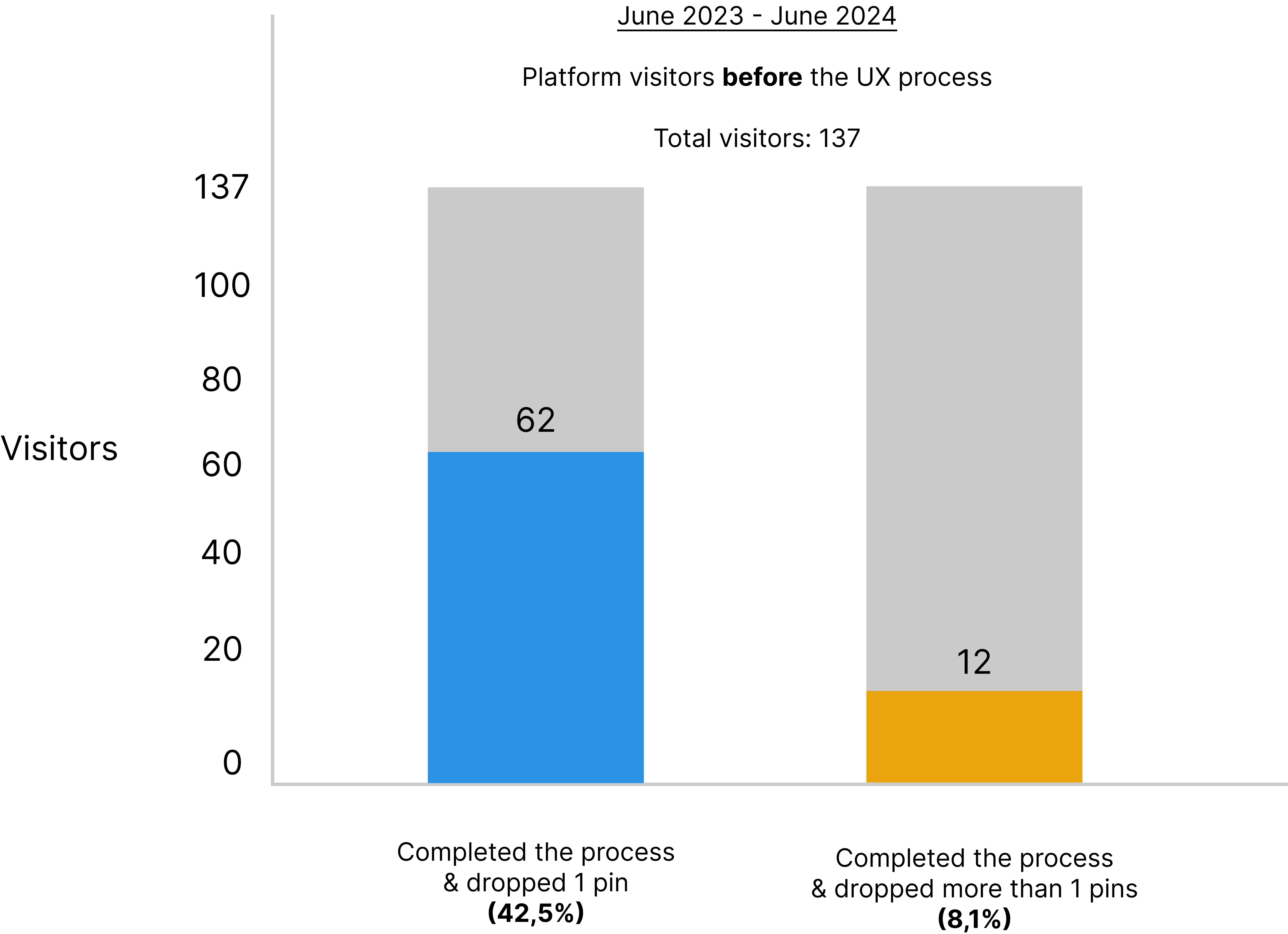
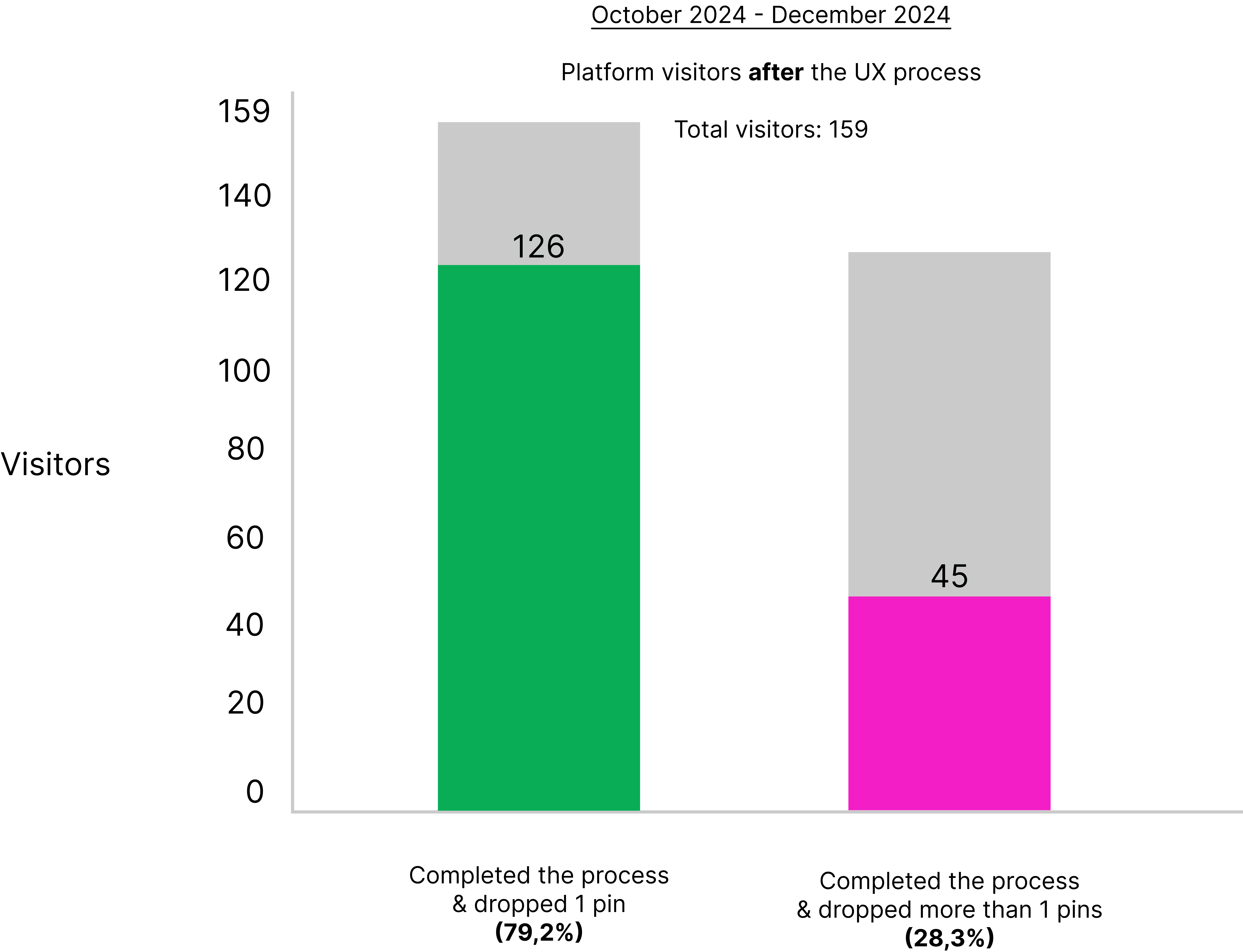
RESULTS
34% increase in process completion
20,2% increase in user retention
50,6% decrease in time taken to completion
The goal:
A reliable navigation service
showing the safest route
COMPANY'S ULTIMATE GOAL
THE COMPANY'S ULTIMATE GOAL
Your Way Home's ultimate goal was to build
a navigation service where the user would be able
to find the safest route.
To achieve this goal, the team needed
a well-functioning algorithm.
To build this algorithm, we needed data.
Your Way Home's ultimate goal was to build
a navigation service where the user would be able
to find the safest route.
To achieve this goal, the team needed
a well-functioning algorithm.
To build this algorithm, we needed data.
The goal:
A reliable navigation service
showing the safest route
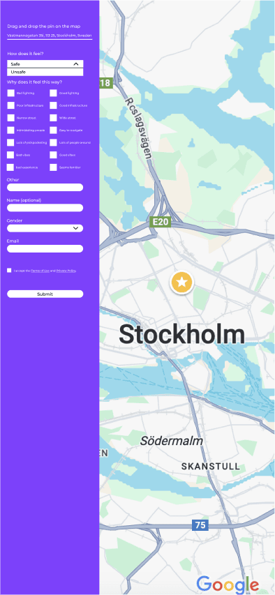
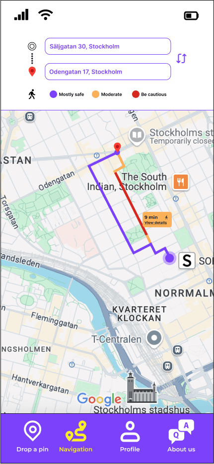
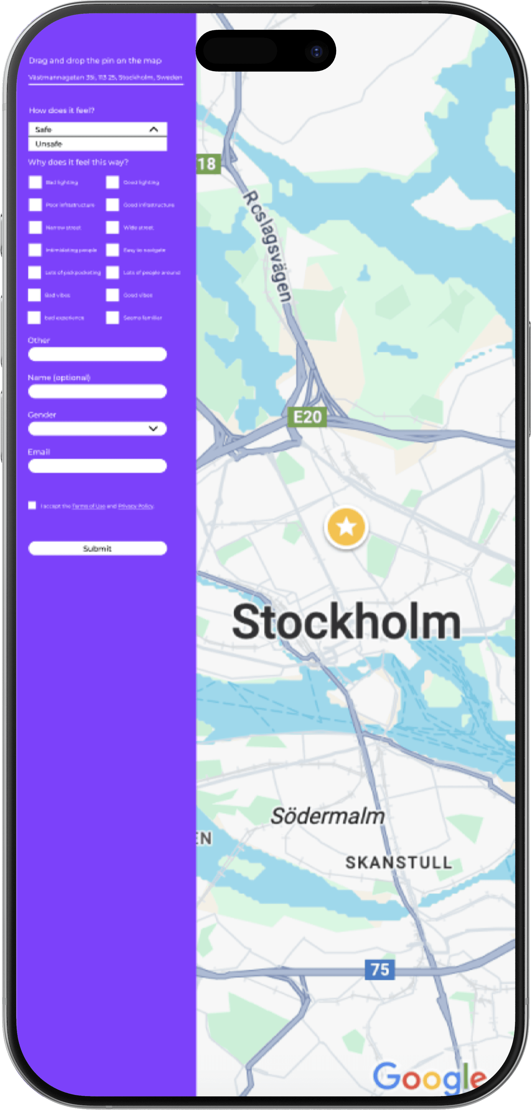
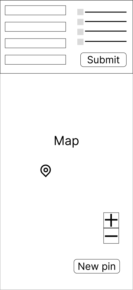
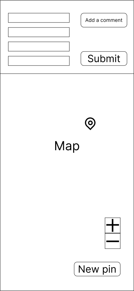
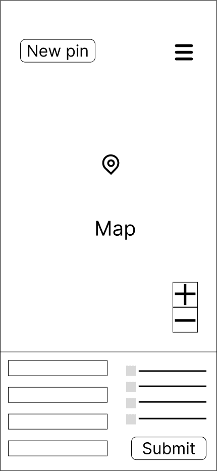
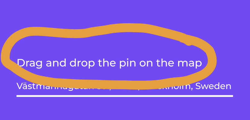
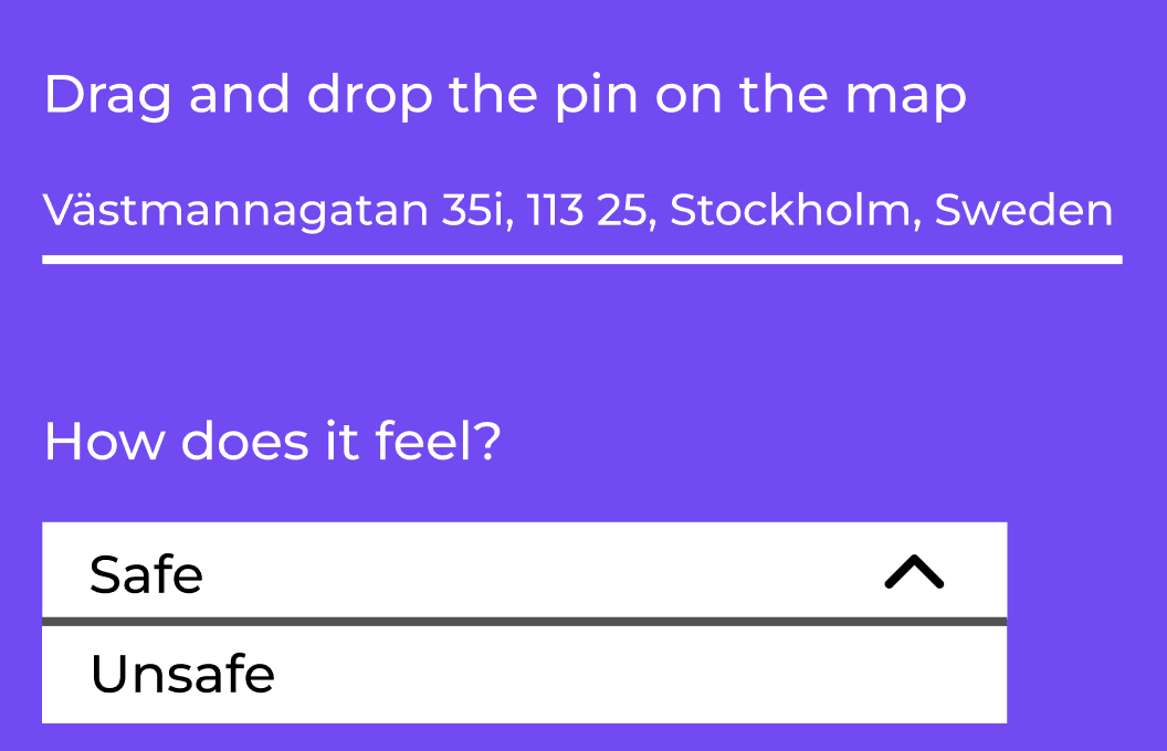
Picture below: the original interface of the "Drop-a-pin" platform.
This interface was used for the first round of usability testing,
to identify potential usability issues.
Drop-a-pin
original interface
THE "DROP-A-PIN FEATURE"
The data was collected through the "Drop-a-pin" feature, a platform where users rated places and answered some questions about safety to help us gather valuable information.
In short, the "Drop-a-pin" feature was the data collector that would help the team achieve the goal of building a reliable algorithm.
The picture below shows the original interface of the "Drop-a-pin" platform.
This interface was used for the first round of usability testing to identify potential usability issues.
THE "DROP-A-PIN" FEATURE
The data was collected through the "Drop-a-pin" feature, a platform where users rated places and answered some questions about safety to help us gather valuable information.
In short, the "Drop-a-pin" feature was the data collector that would help the team achieve the goal of building a reliable algorithm.
The picture below shows the original interface of the "Drop-a-pin" platform.
This interface was used for the first round of usability testing to identify potential usability issues.
Drop-a-pin
original interface
MY ROLE
As the only Product Designer in the team, I was responsible for the whole UX process, end-to-end, in collaboration with the team. My role included understanding user needs through interviews, conducting heuristic evaluations and collaborating with the team to identify pain points, testing our new ideas with the users frequently and redesigning the "Drop-a-pin" interface to encourage more contributions. Throughout the project I worked closely with the front-end, marketing and leadership team to align the final design with both user needs and business goals.
MY ROLE
As the only Product Designer in the team, I was responsible for the whole UX process,
end-to-end, in collaboration with the team. My role included understanding user needs through interviews, conducting heuristic evaluations, collaborating with the team to identify pain points, testing our new ideas with the users frequently and redesigning
the "Drop -a-pin" interface to encourage more contributions. Throughout the project
I worked closely with the front-end, marketing and leadership team to align the final design with both user needs and business goals.
As the only Product Designer in the team, I was responsible for the whole UX process, end-to-end, in collaboration with
the team. My role included understanding user needs through interviews, conducting heuristic evaluations, collaborating with the team to identify pain points, testing our new ideas with the users frequently and redesigning the "Drop -a-pin" interface
to encourage more contributions. Throughout the project,
I worked closely with the front-end, marketing and leadership team to align the final design with both user needs and business goals.
PROCESS
Process planning: I began by understanding the company's market position and how well-known it was to the public. At the same time, I planned the way I would proceed with the process. I started planning interviews for our research process and brainstorming about how we could improve the interface.
Process planning: I began by understanding the company's market position and how
well-known it was to the public.
At the same time, I planned
the way I would proceed
with the process. I started planning interviews for our research process and brainstorming about how we could improve the interface.
Process planning: I began by understanding the company's market position and how well-known it was to the public.
At the same time, I planned the way I would proceed with the process. I started planning interviews for our research process and brainstorming about how we could improve the interface.
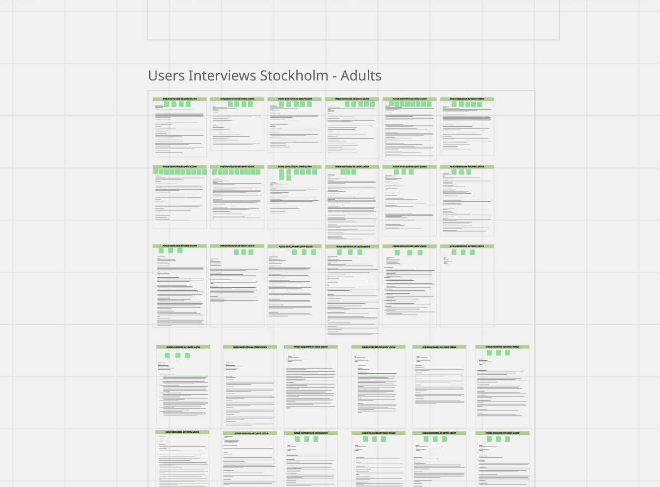
Research & Analysis: I planned and conducted interviews with potential users to validate whether the safety issue existed and to assess if the "Drop-a-pin" project was a meaningful starting point for addressing it. All the interviews were documented with Tactiq and organised in Miro which allowed the entire team to review the findings collectively.
Research & Analysis: I conducted interviews to validate whether the safety issue existed and to assess whether the platform was
a meaningful starting point for addressing it. All the interviews were documented and organised in Miro which allowed the entire team to review the findings collectively.
The picture's low definition
is intentional to ensure the interviewers' anonymity.
Research & Analysis: I conducted interviews to validate whether the safety issue existed and to assess
whether the platform was a meaningful starting point for addressing it. All the interviews were documented and organised in Miro which allowed the entire team to review the findings collectively.
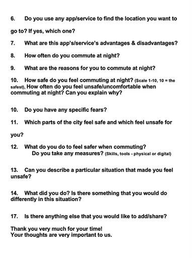
The pictures below show the interview questions that I asked to assess if we were solving the right problem.
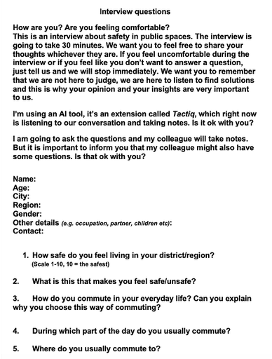
Interviews' insights organised in Miro.
The picture's low definition is intentional to ensure the interviewers' anonymity.
Intrviews' insights organised in Miro.
The picture's low definition is intentional to ensure the interviewers' anonymity.
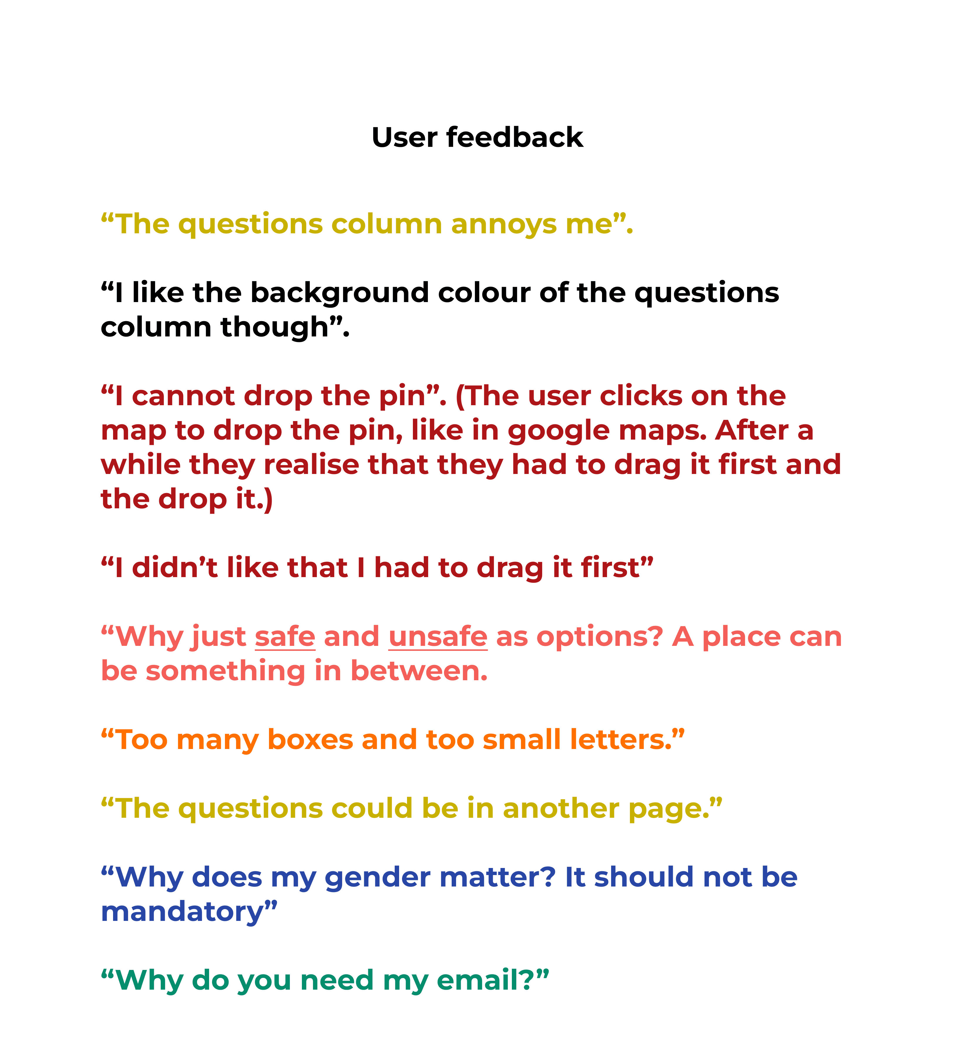
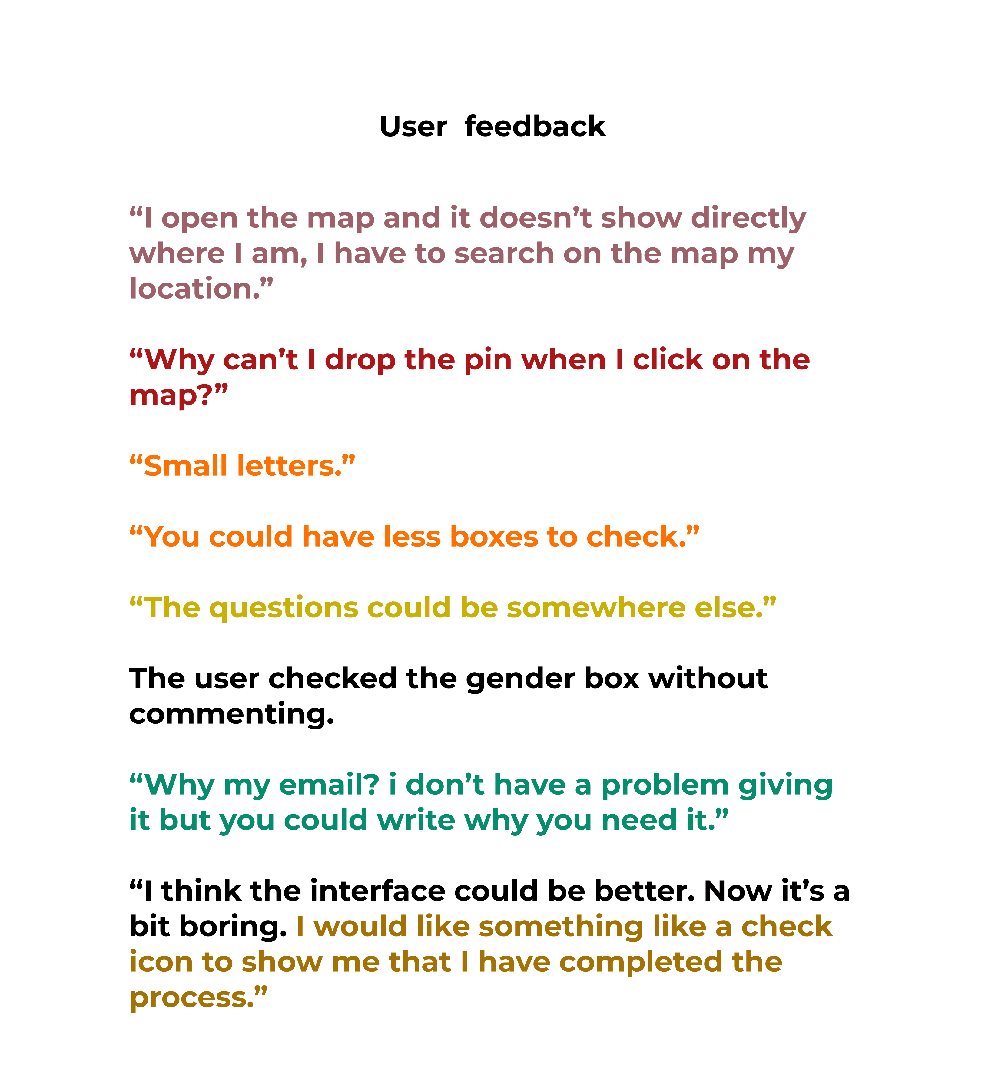
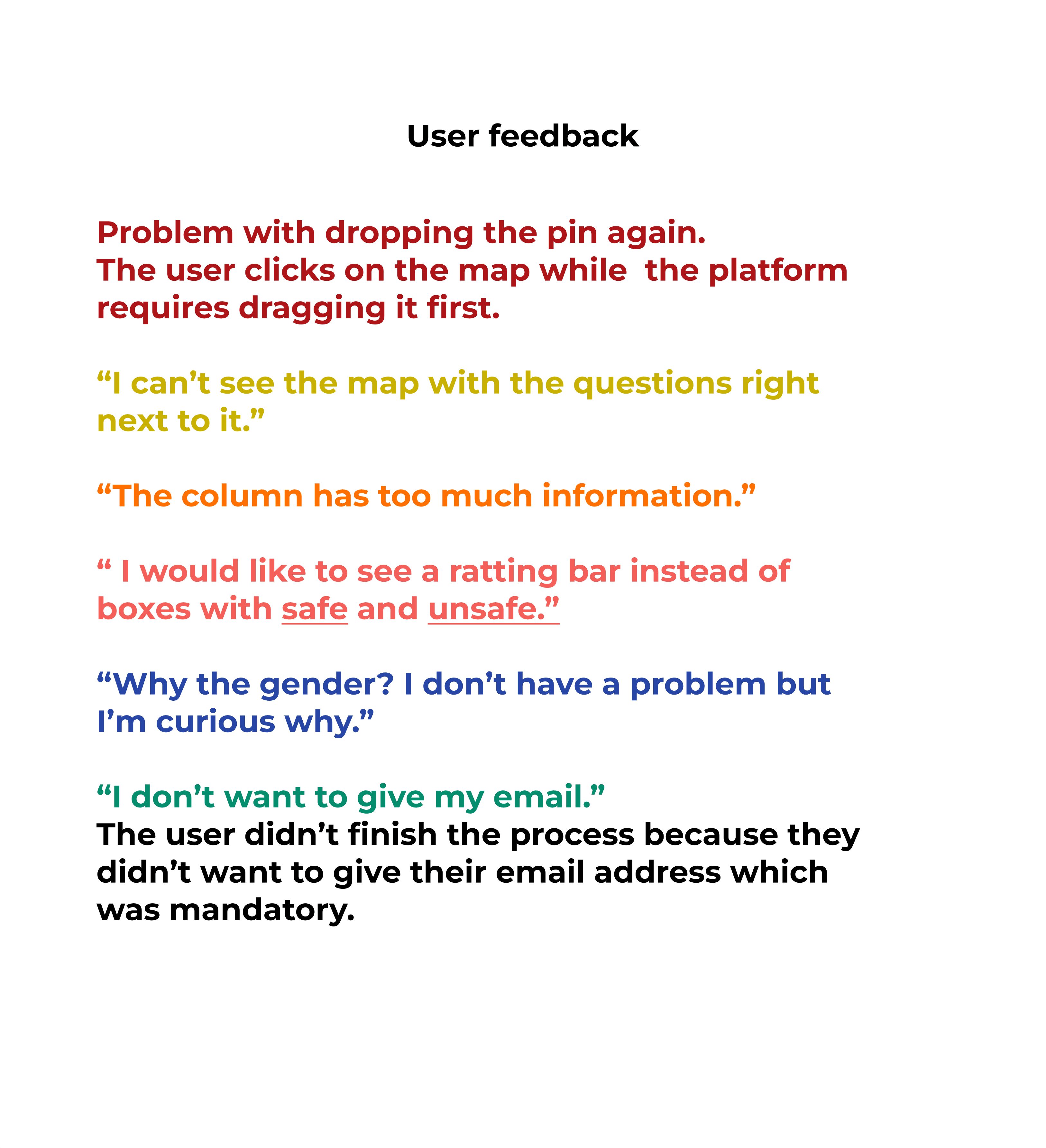
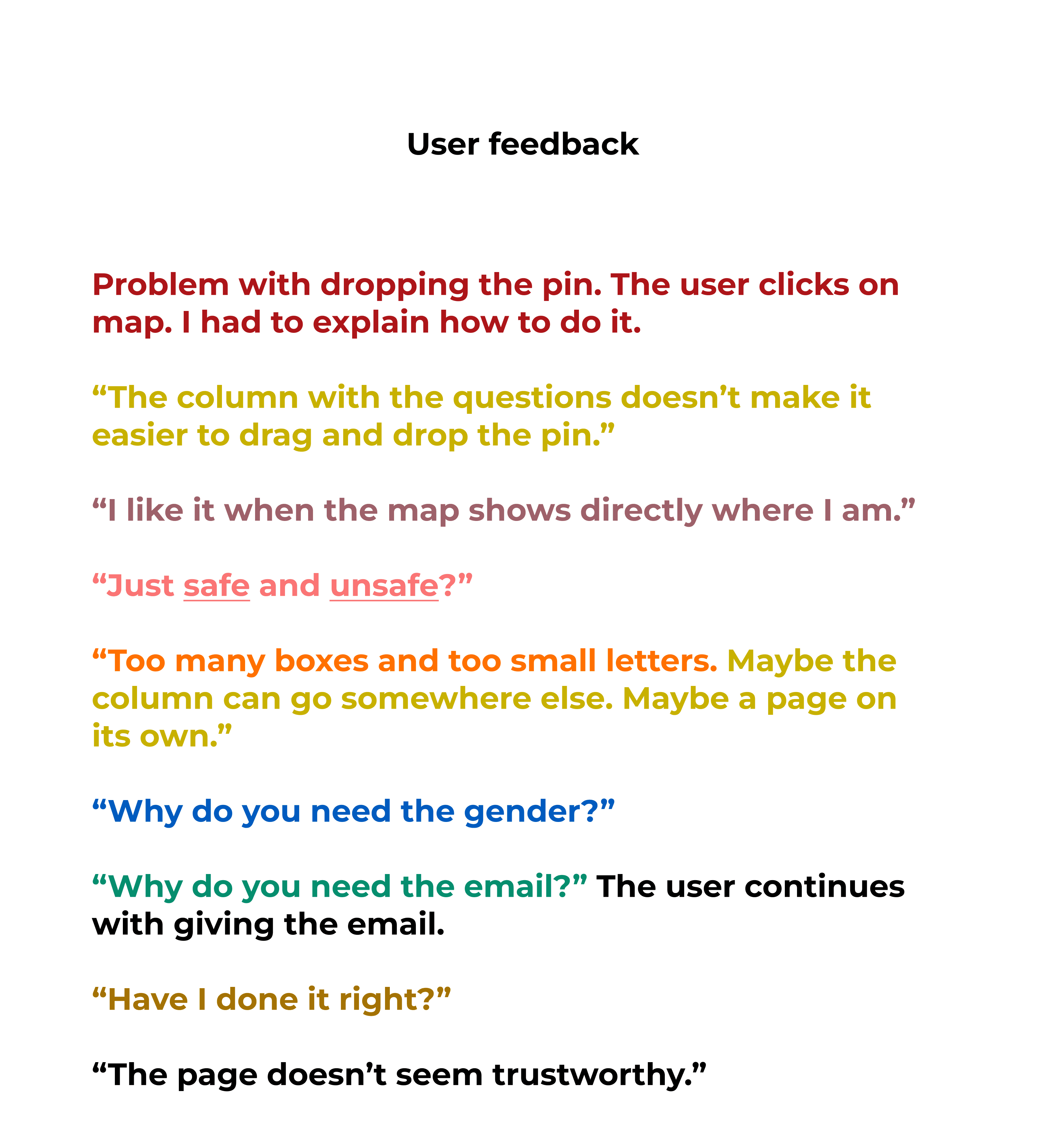
First round of usability testing: In parallel with the interviews, I tested the original interface and collected feedback. I used the Think Aloud method and all tests were conducted on each user's mobile phone in order to have a picture
as realistic as possible.
The scenario:
"Find a place on the map
that you have certain feelings about its safety, rate it and answer the questions".
I gathered the feedback and examined the recurring themes.
I gave each recurring theme its own colour code so I could quickly identify the patterns that came up again and again.
First round of usability testing: In parallel with the interviews, I tested the original interface and collected feedback. I used the Think Aloud method and all tests were conducted on each user's mobile phone to have a picture as realistic as possible. The scenario: "Find a place on the map that you have certain feelings about its safety, rate it and answer the questions". I gathered the feedback in Figma and Miro so the whole team would have access to it and I examined the recurring themes. I gave each recurring theme its own colour code so I could quickly identify the patterns that came up again and again.
First round of usability testing: In parallel with the interviews, I tested the original interface and collected feedback. I used the Think Aloud method and all tests were conducted on each user's mobile phone to have a picture as realistic as possible. The scenario: "Find a place on the map that you have certain feelings about its safety, rate it and answer the questions". I gathered the feedback and examined the recurring themes. I gave each recurring theme its own colour code so I could quickly identify the patterns that came up again and again.
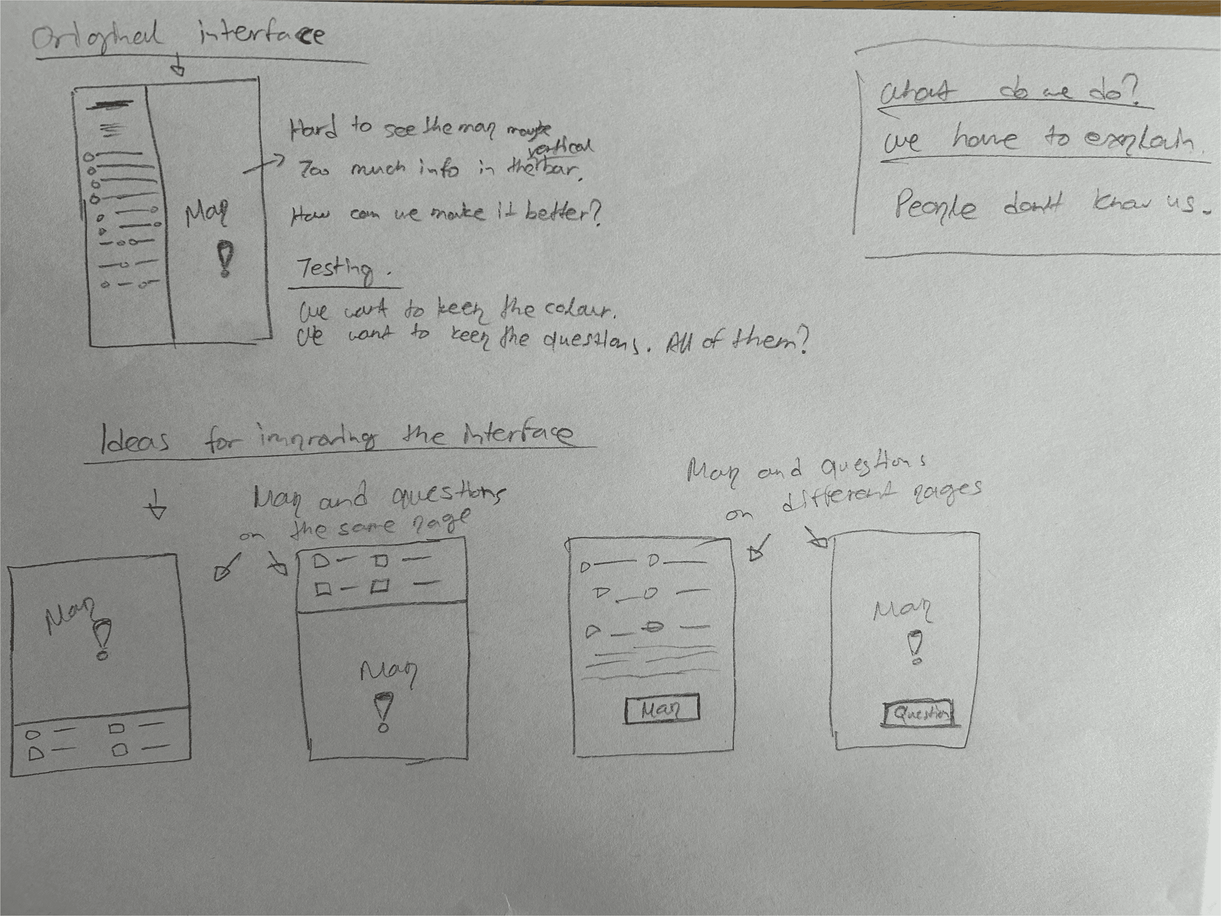
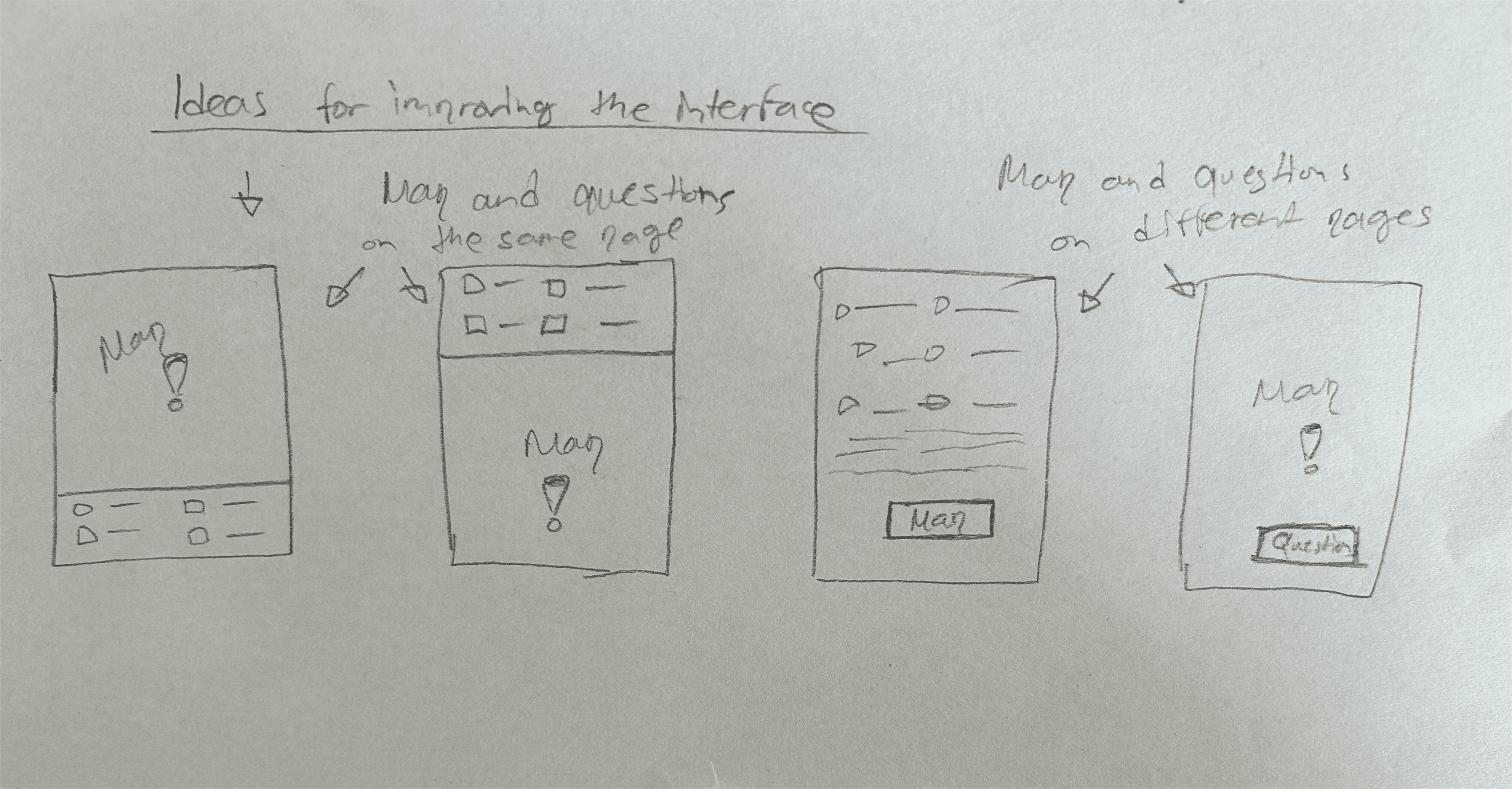
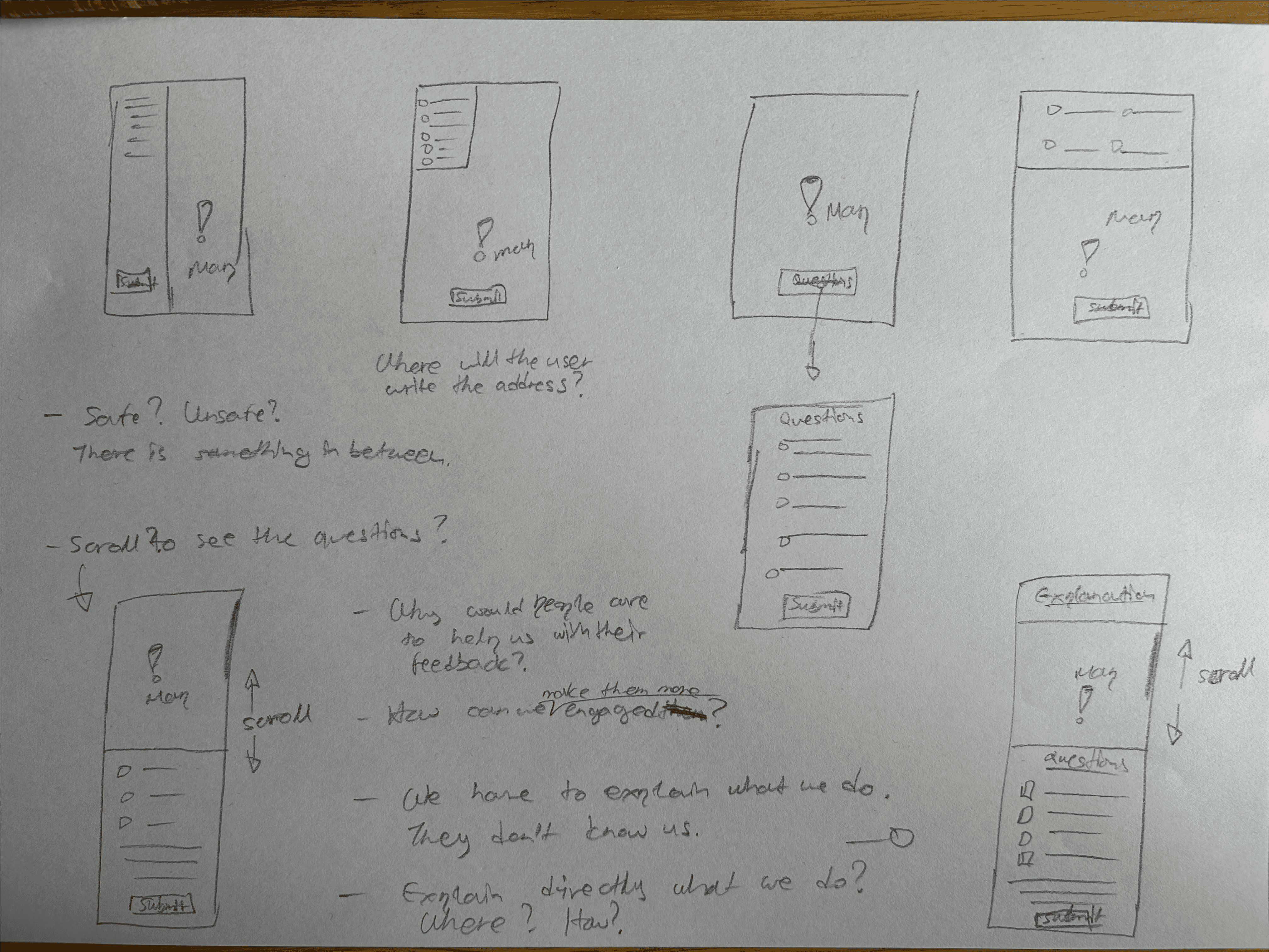
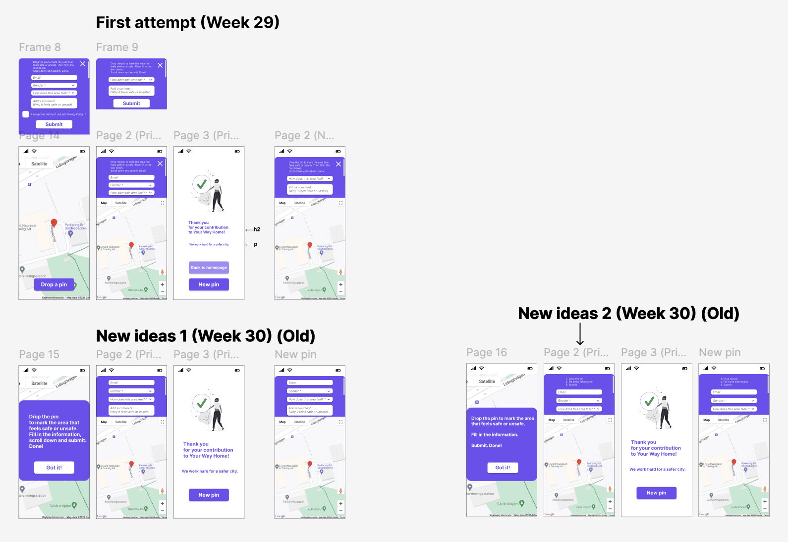
Wireframing and prototyping: People's insights about the interface and the recurring themes helped me with new design ideas for the "Drop-a-pin". Many iterations took place until the launch of the final result.
Iterations: I started with low- and mid-fidelity wireframes and mockups in order to create a cleaner layout. I tested new ways to present the map and the questionnaire.
The mockups were iteratively refined based on both
user feedback from the first usability testing and team feedback.
Wireframes & mockups: People's insights about the interface and the recurring themes helped me with new design ideas for the "Drop-a-pin". In parallel with the interviews and testing, I worked continuously with new design ideas. Many iterations took place until the launch of the final result.
Iterations: I started with low- and mid-fidelity wireframes and mockups
in order to create a cleaner layout. I tested new ways for presenting the map
and the questionnaire. The mockups were iteratively refined based on both user feedback from the first usability testing and team feedback.
The wireframes on paper below show ideas that led to more detailed mockups.
The mockups below show the iterations that later resulted in a redesigned and refined "Drop-a-pin" process.
The mockups below show the iterations that later resulted in a redesigned and refined "Drop-a-pin" process.

The pictures below show the team's 7 design iterations and my work in Figma that led to the final result.
The pictures below show the team's 7 design iterations
and my work in Figma that led to the final result.
The pictures below show the team's 7 design iterations
and my work in Figma that led to the final result.
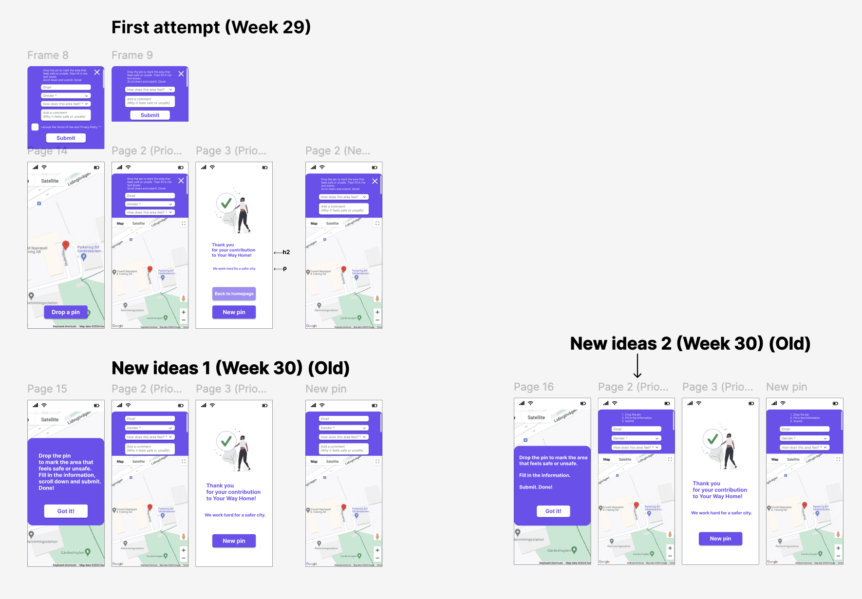
1st iteration
The first attempts
to optimisethe interface
in order to start
the UX Design process.
3rd iteration
By the 3rd iteration
we had a new version
of our service.
We could now test
the new ideas
and move forward
to optimise
the user experience.
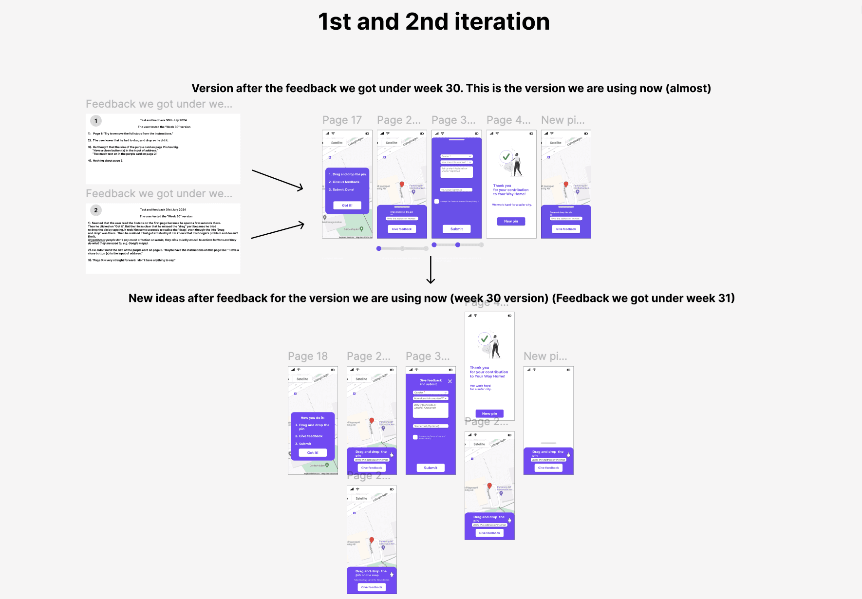
1st and 2nd iteration
The first attempts to optimise the interface
in order to start the UX Design process.
3rd iteration
By the 3rd iteration
we had a new version of our service.
We could now test the new ideas
and move forward to optimise the user experience.
4th iteration
Optimising the UX-writing and microcopy
4th iteration
Optimising the UX-writing
and microcopy
5th iteration
Consideration of including new features,
such as language preference.
5th iteration
Consideration of including
new features,
such as language preference.
6th iteration
At this poin, the interface is closer to its final form.
6th iteration
At this poin,
the interface is closer
to its final form.
7th iteration
Feedback implementation after testing
and exploring new ideas that users suggested, e.g. “View my pins”.
7th iteration
Feedback implementation
and exploring new ideas that users suggested,
e.g. “View my pins”.
1st and 2nd iteration
The first attempts to optimise
the interface in order to start
the UX Design process.
3rd iteration
By the 3rd iteration we had a new version of our service.
We could test the new ideas with users and move forward to optimise the user experience.
4th iteration
Optimising the UX-writing
and microcopy.
5th iteration
Consideration of including new features, such as language preference.
6th iteration
At this point, after multiple
user testings during the iterations,
the interface is closer
to its final form.
7th iteration
Feedback implementation after user
testing and exploring ideas that users suggested during the testing,
e.g. "view my pins".
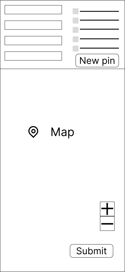
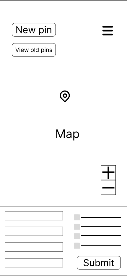
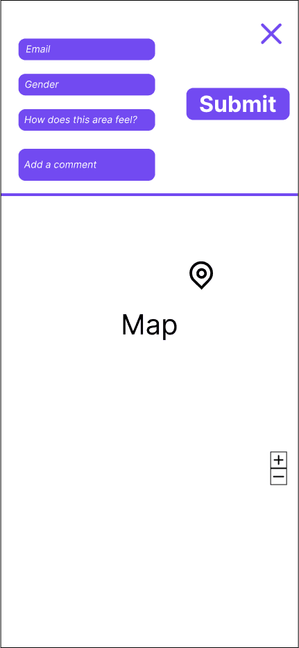
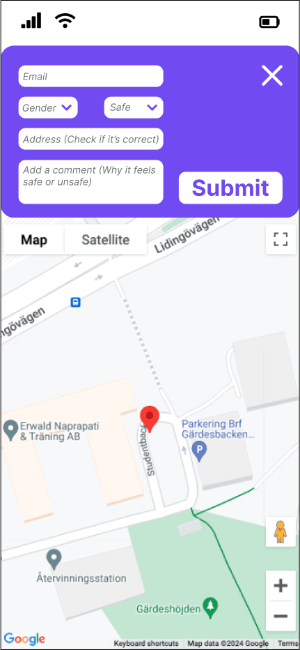
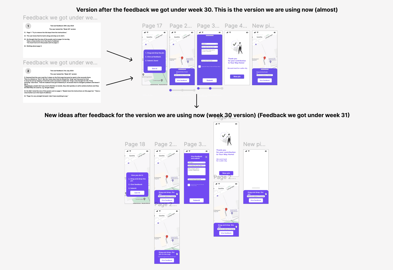
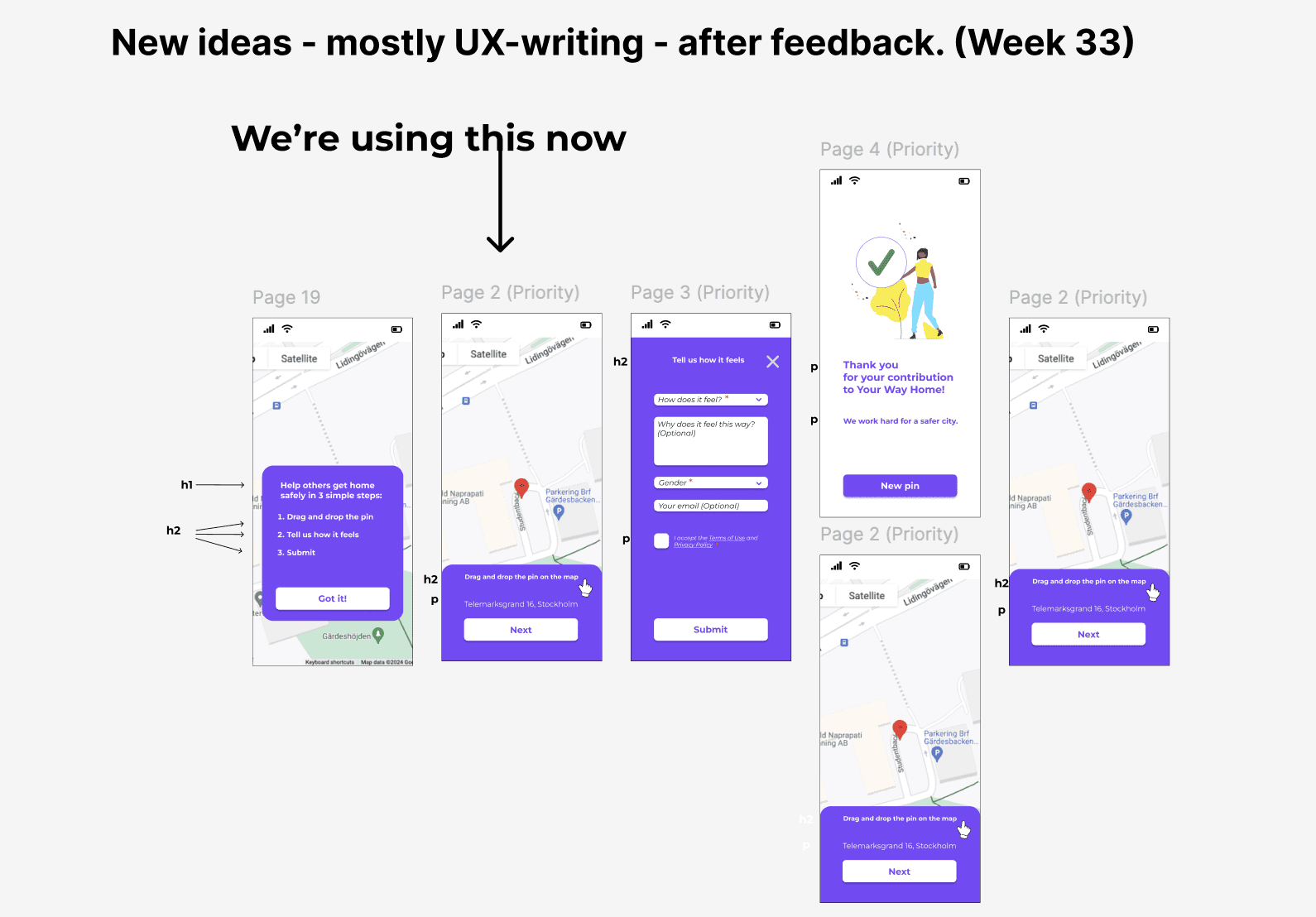
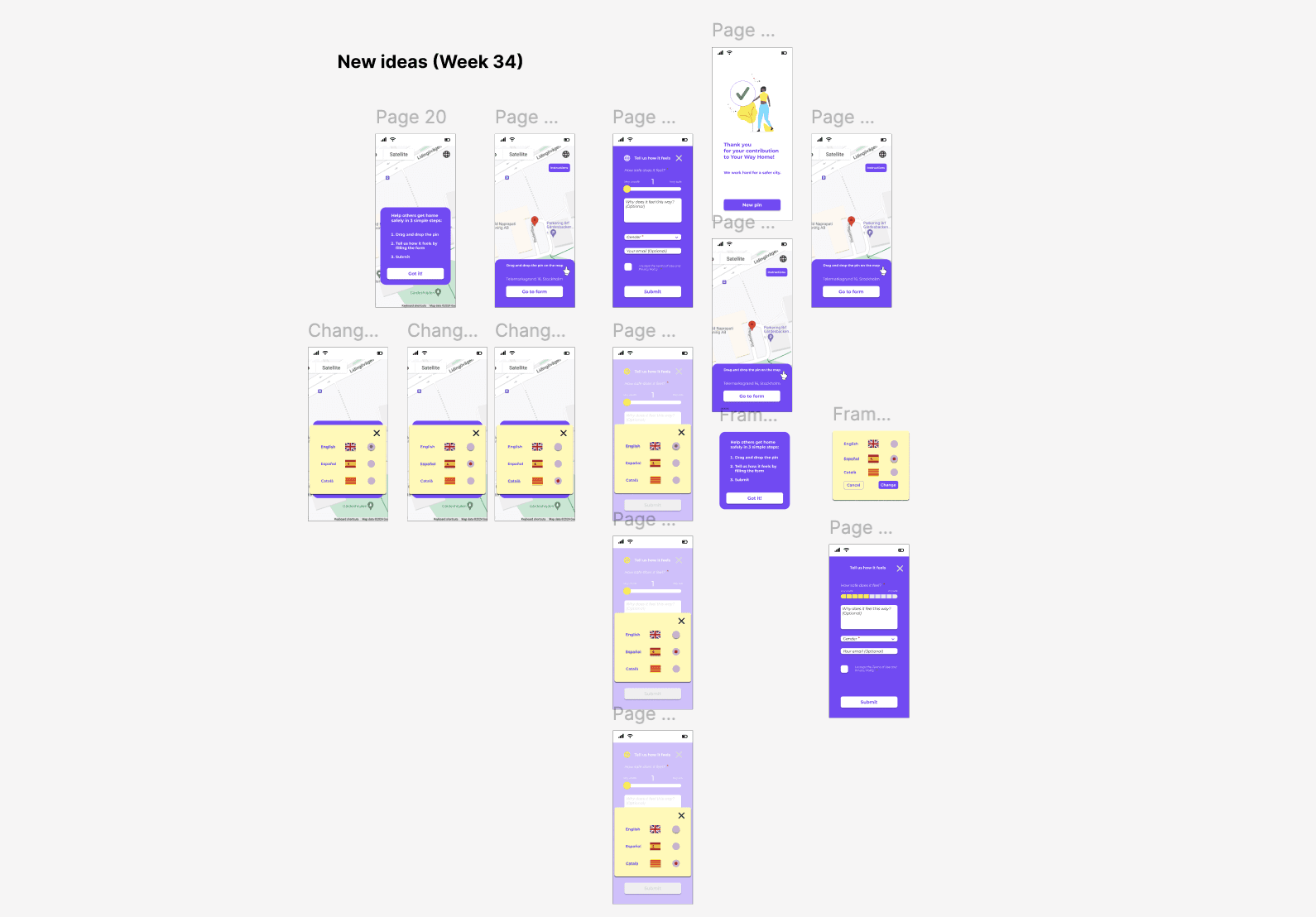
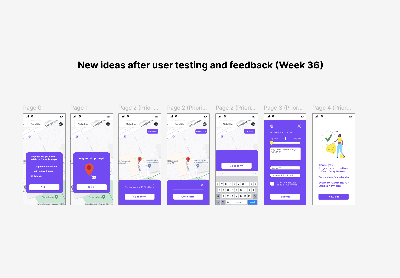
After the iterations, the "Drop-a-pin" process took its improved form.
After the iterations, the "Drop-a-pin" process took its improved form.
After the iterations,
the "Drop-a-pin" process took its improved form.
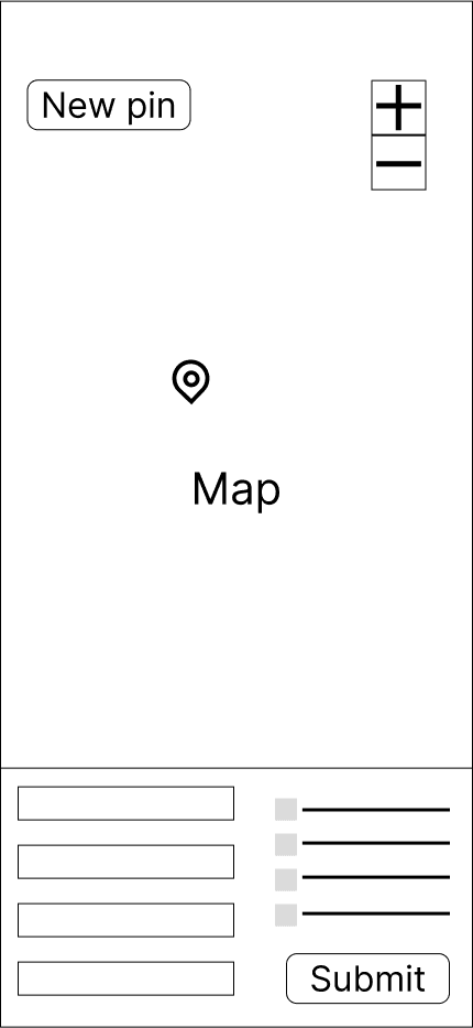
Before the UX process ⬇️
Drop-a-pin
original interface
Drop-a-pin
original interface
After the UX process ⬇️
After the UX process ⬇️
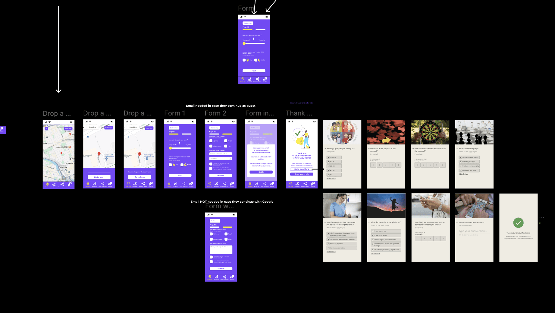
The video below shows the interactive prototype of the redesigned "Drop-a-pin" process.
The video below shows the interactive prototype
of the redesigned "Drop-a-pin" process.
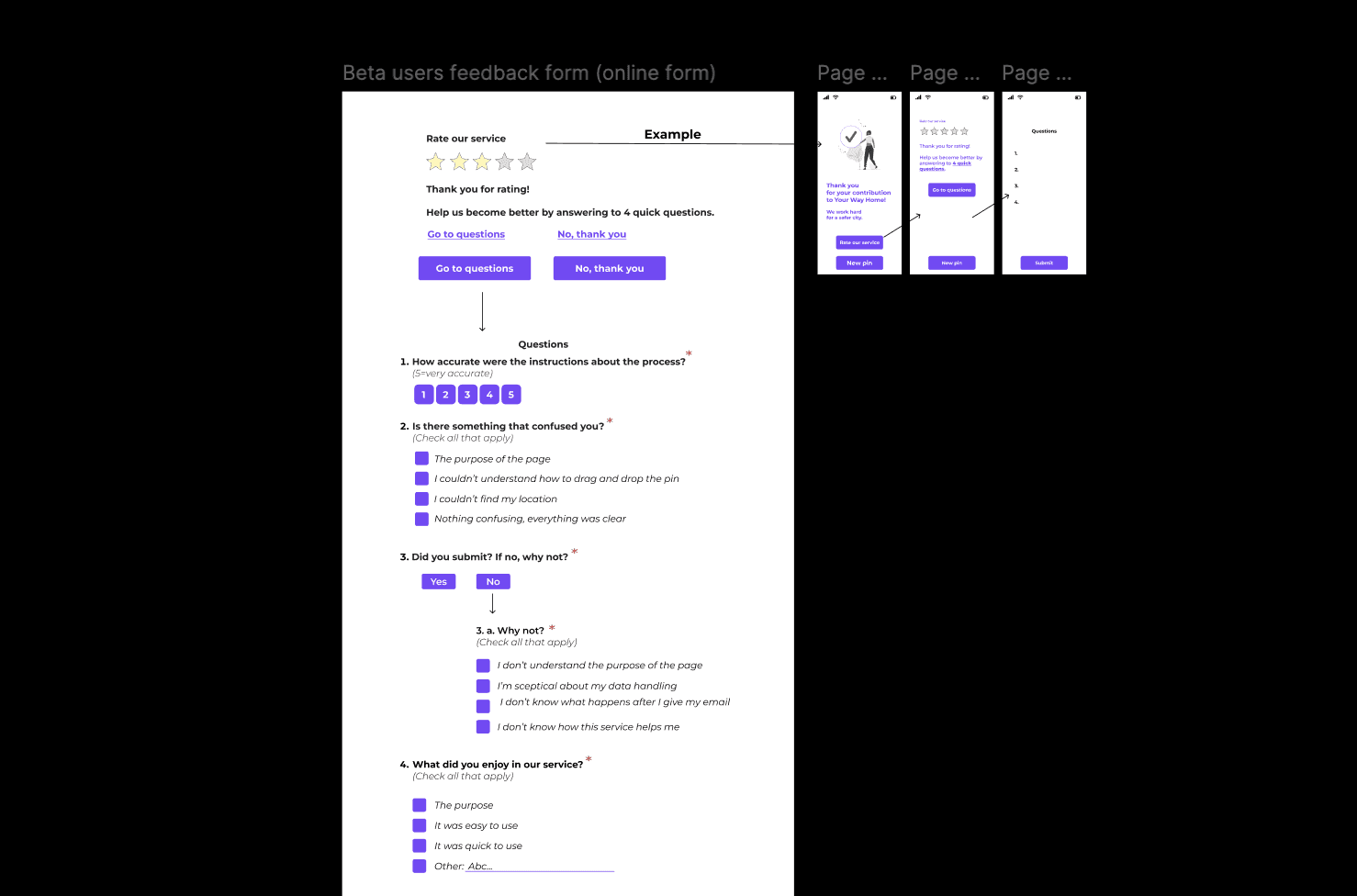
Metrics & Typeform: Feedback is the most valuable tool
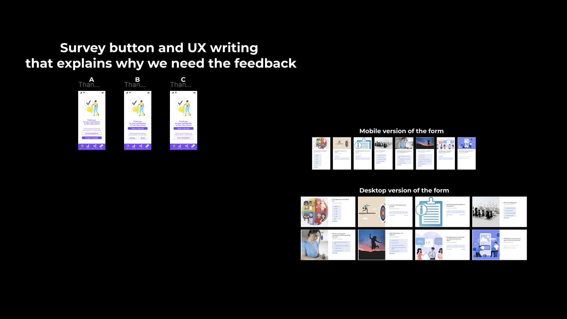
a team can get. After some research about how to collect as much feedback as possible, I proposed the idea of using Typeform. The idea was to create an enjoyable survey which we would connect to our "Drop-a-pin" process through a "Go to survey" button at the end of the process. Above the button, we would of course explain what the survey was about and that we needed the feedback from our users in order to improve our service.
Designing the survey: I wrote the questions, I decided which of them would be mandatory and which optional and decided the types of answer formats (multiple choice - single or multiple answer/-s, rating scales and writing a short answer).
After 3 iterations and team discussions about both UX writing and the survey's visuals, the survey about the "Drop-a-pin" process was ready.
Metrics & Typeform: Feedback is the most valuable tool a team can get. After some research about how to collect as much feedback as possible,
I proposed the idea of using Typeform. The idea was to create an enjoyable survey which we would connect to our "Drop-a-pin" process through a "Go to survey" button at the end of the process. Above the button, we would of course explain what the survey was about and that we needed the feedback from our users in order to improve our service.
Designing the survey: I wrote the questions, I decided which of them would be mandatory and which optional
and decided the types of answer formats (multiple choice - single or multiple answer/-s, rating scales and writing a short answer).
After 3 iterations and team discussions about both UX writing and the survey's visuals,
the survey about the "Drop-a-pin" process was ready.
1st iteration
1st iteration
1st iteration
1st iteration
1st iteration
1st iteration
1st iteration
1st iteration
1st iteration
2nd iteration
2nd iteration
2nd iteration
2nd iteration
2nd iteration
2nd iteration
3rd iteration
3rd iteration
3rd iteration
3rd iteration
3rd iteration
3rd iteration
Unfortunately, the survey never made it to the public. Instead, we gathered qualitative feedback through the 5th stage of our UX process, the second round of usability testing.
Unfortunately, the survey never made it to the public. Instead, we gathered qualitative feedback through the 5th stage of our UX process, the second round of usability testing.
Second round of usability testing: The final prototype and the code of the new version were ready tand we updated the platform. With the new "Drp-a-pin" version published, it was time for another round of usability testing. In this round, I tested the redesigned "Drop-a-pin" process with two distinct groups.
Group 1: Participants who had previously tested the original version of the product.
Group 2: First-time testers who were only exposed to the redesigned version.
Why two groups: I wanted to balance familiarity with fresh perspectives. Users in Group 1 had experience with the old design which could lead to positive bias. They might view the new version as better simply because it fixed obvious issues. To avoid relying solely on that biased validation I included Group 2 to ensure the new design was intuitive and effective even for users seeing it for the first time. This approach allowed me to gather more objective and well-rounded feedback.
Testing results: Both groups found the new interface intuitive and easy to use. Several participants even expressed a desire to drop multiple pins describing the interaction as engaging and enjoyable. In addition, both groups also provided valuable new insights which we took under consideration for the product's further development.
Second round of usability testing: The final prototype and the code of the new version were ready and we updated the platform. With the new "Drop-a-pin" version published, it was time for another round of usability testing. In this round, I tested the new "Drop-a-pin" process with two distinct user groups:
Group 1: Participants who had previously tested the original version of the product.
Group 2: First time testers who were only exposed to the redesigned version.
Method used: Think Aloud
Scenario: Find a place on the map that you have certain feelings about its safety, rate it and answer the questions.
Why two groups: I wanted to balance familiarity with fresh perspectives.
Users in Group 1 had experience with the old design which could lead to positive bias. They might view the new version as better simply because it fixed obvious issues.
To avoid relying solely on that biased validation I included Group 2 to ensure the new design was intuitive and effective even for users seeing it for the first time.
This approach allowed me to gather more objective and well-rounded feedback.
Testing results: Both groups found the new interface intuitive and easy to use. Several participants even expressed a desire to drop multiple pins describing the interaction as engaging and enjoyable. In addition, both groups also provided valuable new insights which we took under consideration for the product's further development.
Second round of usability testing: The final prototype and the code of the new version were ready and we updated the platform. With the new "Drop-a-pin" version published, it was time for another round of usability testing. In this round,
I tested the new "Drop-a-pin" process with two distinct user groups.
Group 1: Participants who had previously tested the original version of the product.
Group 2: First time testers who were only exposed to the redesigned version.
Why two groups: I wanted to balance familiarity with fresh perspectives.
Users in Group 1 had experience with the old design which could lead to positive bias. They might view the new version as better simply because it fixed obvious issues.
To avoid relying solely on that biased validation I included Group 2 to ensure the new design was intuitive and effective even for users seeing it for the first time.
This approach allowed me to gather more objective and well-rounded feedback.
Testing results: Both groups found the new interface intuitive and easy to use. Several participants even expressed a desire to drop multiple pins describing the interaction as engaging and enjoyable. In addition, both groups also provided valuable new insights which we took under consideration for the product's further development.
“It was more fun than I expected. I want to drop more pins! I think, though, that the email should not be mandatory. Also, the icon in the "Thank you" page is a bit irrelevant.”
Lina, Group 1 (Had firstly tested the old version)
Second round of usability testing
“Very easy to understand how to do it. I like the rating bar. I would like to see a list of the pins that I have dropped.”
Isabelle, Group 2 (Tested directly the new version)
Second round of usability testing
HOW THE DESIGN DECISIONS WERE MADE
As mentioned before, the goal of the project was to gather crowdsourced data about street/area safety perception in order to develop an algorithm that recommends the safest route to the users. Our design decisions were based on feedback we got from user research and the first usability testing. The goal of the design decisions was to create a "Drop-a-pin" process that showed clearly the purpose of the platform being, at the same time, trustworthy, fun and inspiring.
Instructions
Before
After
The instructions
were not very visible.
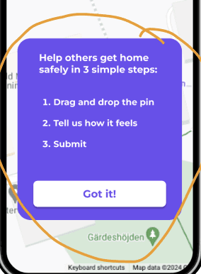
A card with clear instructions directly when opening the app.
The instructions
were not very visible.
A card with clear instructions directly when opening the app.
Before
After
Before
After
The instructions were not very visible.
We also noticed that even though we
had a card dedicated to the instructions,
the users did not read it thoroughly.
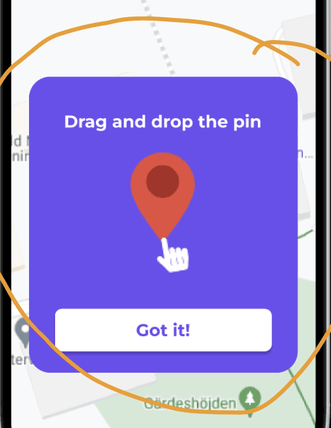
We decided to add one more card
with a GIF in order to show in a simple way that it was important to firstly drag the pin instead of just tapping on the map as most users were used to do.
The instructions were not very visible.
We also noticed that even though we
had a card dedicated to the instructions,
the users did not read it thoroughly.
We decided to add one more card
with a GIF in order to show in a simple way that it was important to firstly drag the pin instead of just tapping on the map as most users were used to do.
Before
After
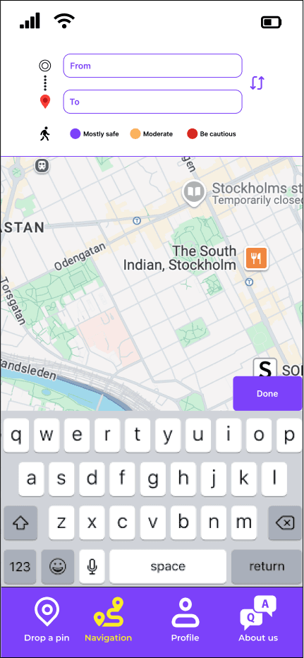
Address and new buttons
Before
After
Not so clear where the user could type the address.
The address has a dedicated space and there is a button that shows what the next step is.
A "Back" button gives a clear exit in case the user wants to correct their rating.
"Install App" button.
gives the user the chance to install the app.
The new design of the form (first page)
The new design of the form
(first page)
Before
After
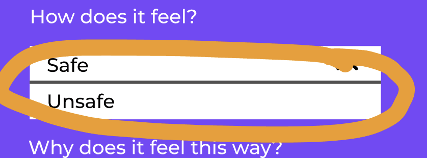
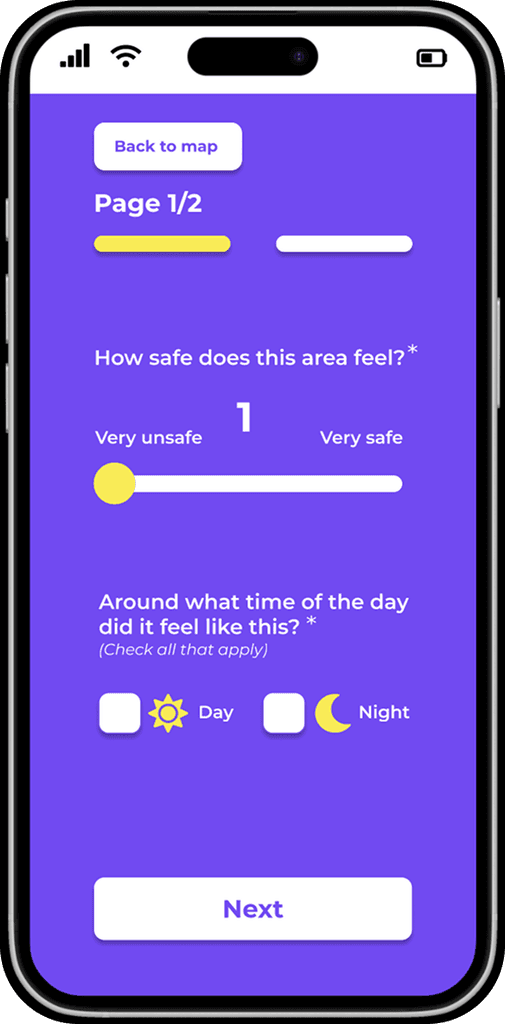
Two options about how a place feels: safe, unsafe.
Only the optional questions were marked.
All the mandatory questions were not marked.
That caused confusion to the users/ testers.
“Next” button since the form was designed in two pages.
Added “day”, “night” since a place can feel different depending
on the time of the day.
A navigation bar instead of just “safe”, “unsafe”.
More accurate solution since
a place can feel
something in between.
In the new design all the mandatory questions were marked.
The form was designed in two pages.
Clear indication of the two pages:
two buttons so the users can easily
explore the form and make changes.
A “Back to map “ button so the users can have the chance to correct or change the place they want to rate without having to restart the app.
A “Back to map “ button so the users can have the chance to correct or change the place they want to rate without having to restart the app.
The form was designed in two pages.
Clear indication of the two pages:
two buttons so the users can easily
explore the form and make changes.
In the new design all the mandatory questions were marked.
A navigation bar instead of just “safe”, “unsafe”.
More accurate solution since
a place can feel
something in between.
Added “day”, “night” since a place can feel different depending
on the time of the day.
“Next” button since the form was designed in two pages.
Before
After
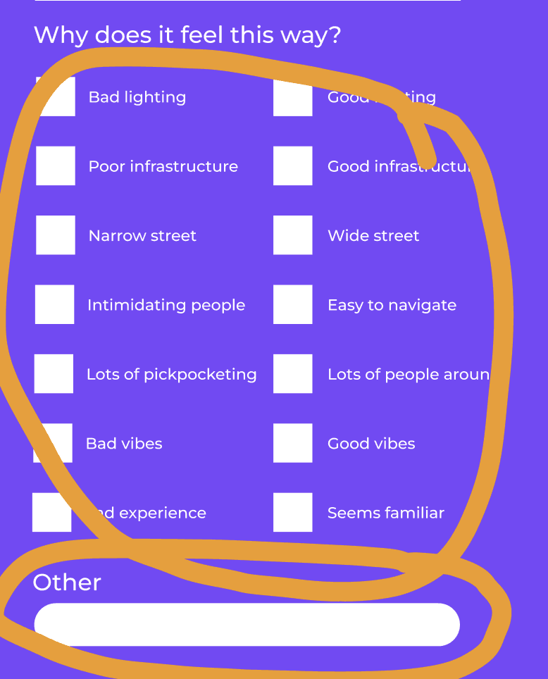
Two options about how a place feels: safe, unsafe.
Only the optional questions were marked.
All the mandatory questions were not marked.
That caused confusion to the users/ testers.
The new design of the form (second page)
Before
After
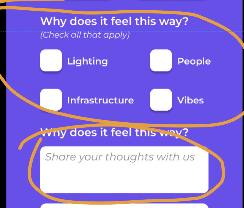
Less boxes and an input where the users could share their thoughts.
Both optional.
Too many boxes for the user to read and check and an input with the vague word "other".
Before
After
Less boxes and an input where the users could share their thoughts.
Both optional.
Too many boxes for the user to read and check and an input with the vague word "other".
The email
Before
After
The new design included an info icon that users could click.
The reason about why the company needed the email was explained in an info box.
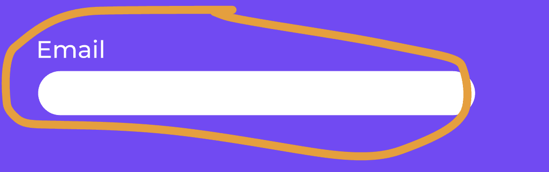
The email was mandatory
but the users/testers were a bit careful about giving such personal info.
They wanted to know first why the company needed their email.
The new design included an info icon that users could click.
The reason about why the company needed the email was explained in an info box.
Before
After
The email was mandatory
but the users/testers were a bit careful about giving such personal info.
They wanted to know first why the company needed their email.
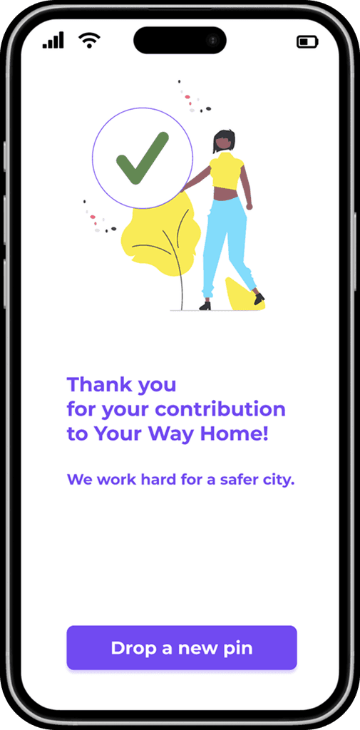
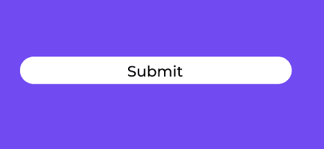
Feedback
When clicked “Submit”
the user did not get any feedback about if the form was successfully submitted or not.
A button that allows the user
to continue rating places
without having to restart the app.
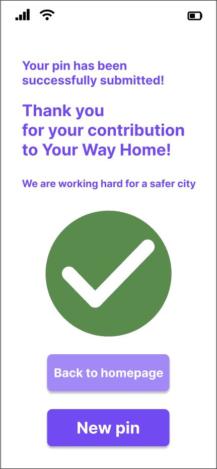
A new page with clear feedback:
a “check” icon and a “Thank you” note.
Before
After
When clicked “Submit”
the user did not get any feedback about if the form was successfully submitted or not.
Before
After
A new page with clear feedback:
a “check” icon and a “Thank you” note.
A button that allows the user
to continue rating places
without having to restart the app.
DATA
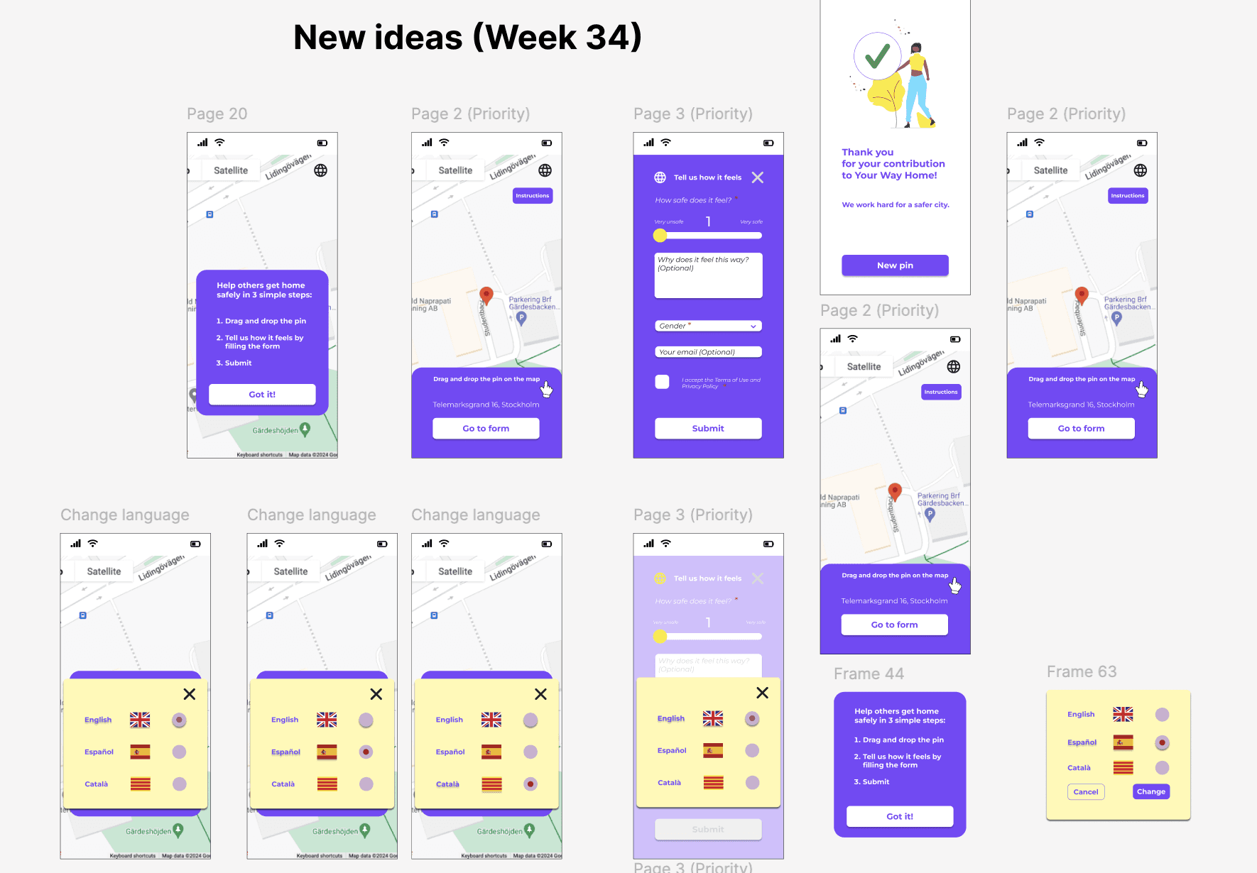
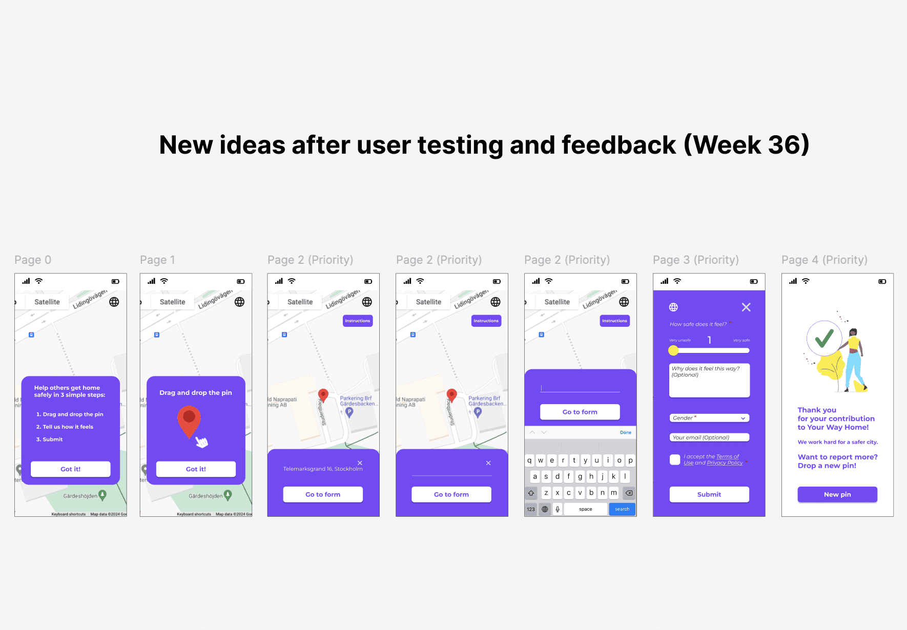
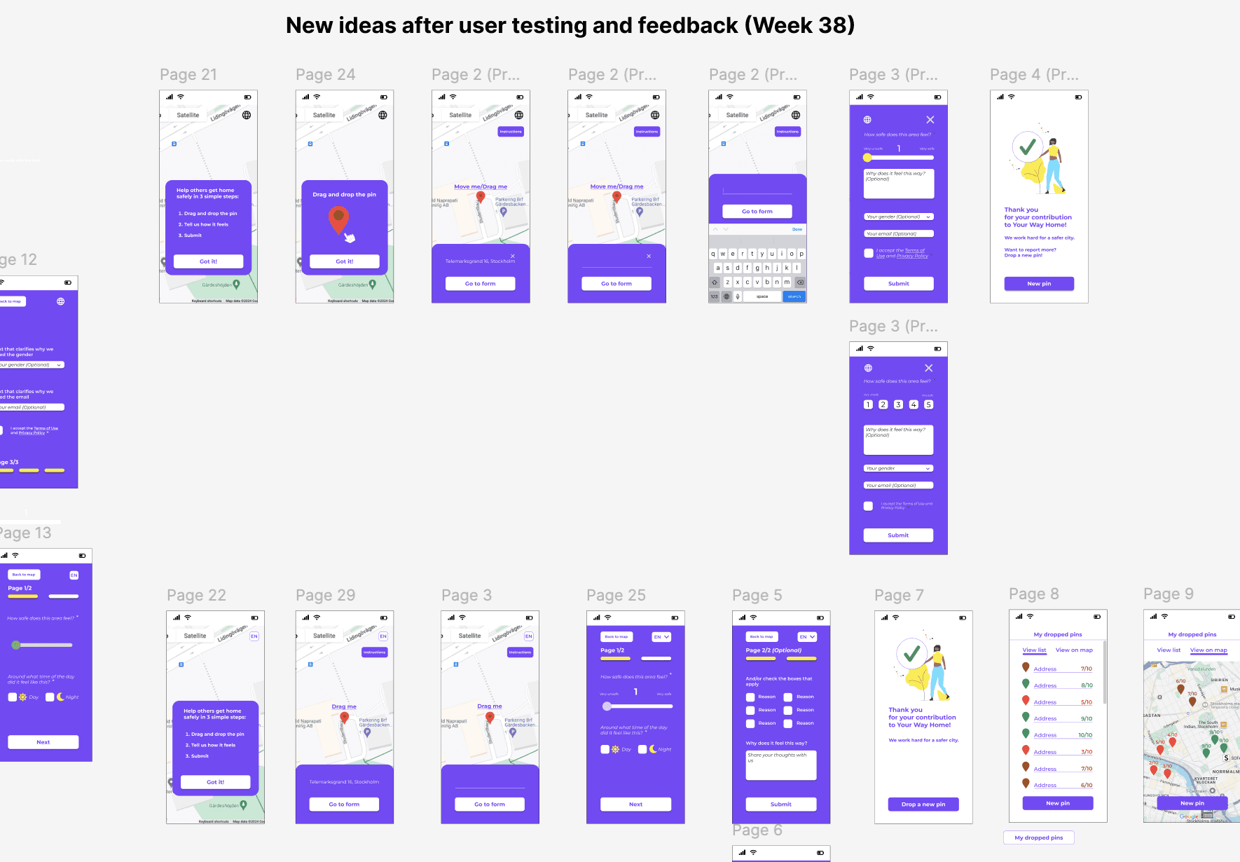
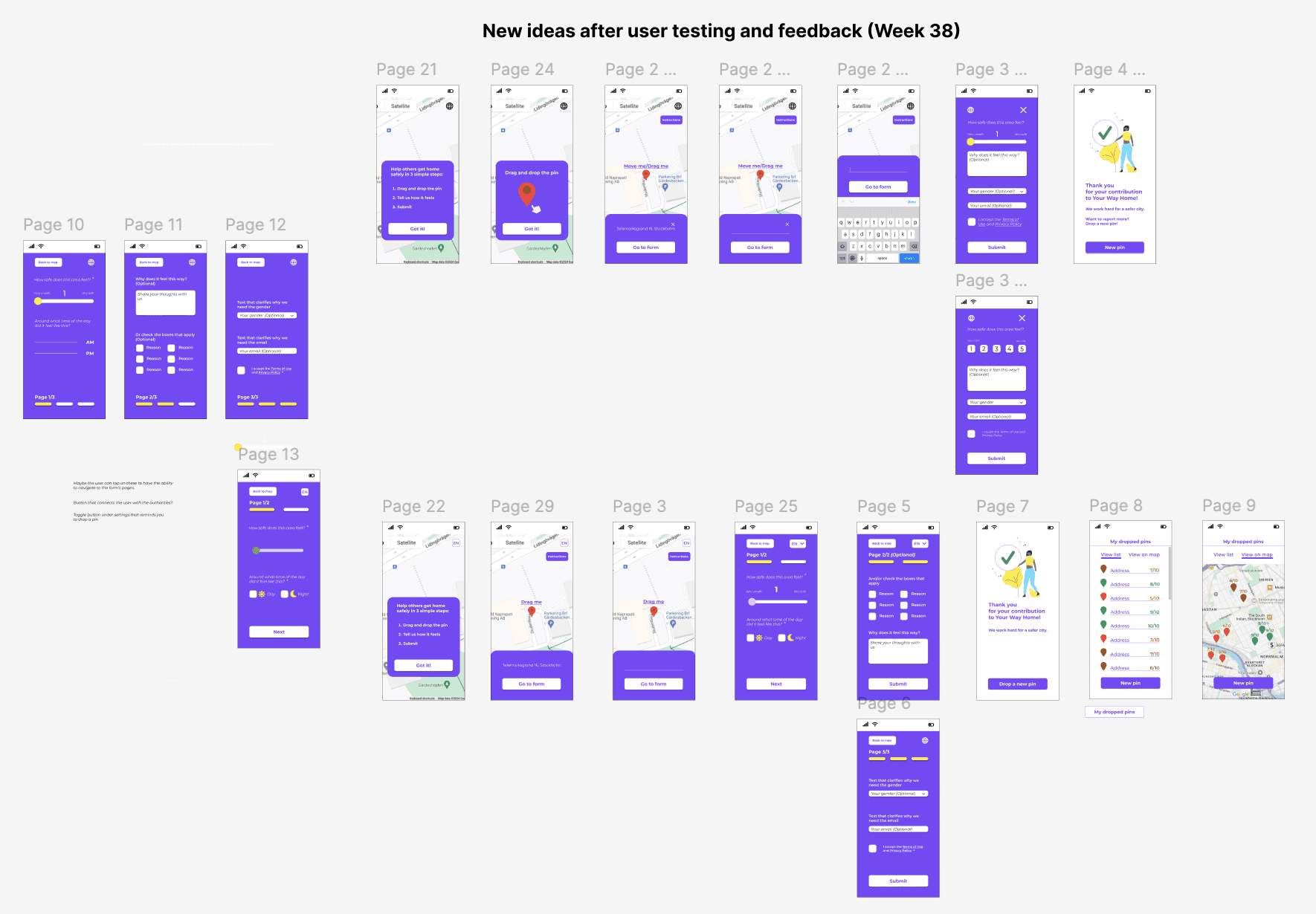
NEW IDEAS AND FUTURE DEVELOPMENT
Both rounds of usability testing added
a lot of value to my work and the design process. They not only confirmed parts of the design that worked well or less well
but also brought up new user needs and ideas. These insights gave a clearer picture of how the platform could grow and evolve in the future and at the same time they worked as a great reminder of how important it is to stay curious and keep listening.
NEW IDEAS AND FUTURE DEVELOPMENT
Both rounds of usability testing added a lot of value to my work and the design process. They not only confirmed parts of the design that worked well or less well but also brought up new user needs and ideas. These insights gave a clearer picture of how the platform could grow and evolve in the future and at the same time they worked as a great reminder of how important it is to stay curious and keep listening.
CONCLUSION
The redesign of the "Drop-a-pin" feature for Your Way Home successfully tackled most of the platform’s usability challenges. It transformed a cluttered interface into
a more intuitive and engaging experience. By simplifying the process, reorganising the questionnaire and applying a cleaner visual language, the platform became more
user-friendly. The improved design encouraged users to drop more pins and interact with the platform more confidently, proving that user-centered design increases engagement.
Something worth mentioning is that the platform was improved by both Your Way Home's team and of course
all the people who participated in user research and usability testings. This proves how valuable user insights are in order to have the best user experience possible.
The redesign of the "Drop-a-pin" feature for Your Way Home successfully tackled most of the platform’s usability challenges.
It transformed a cluttered interface into
a more intuitive and engaging experience.
By simplifying the process, reorganising
the questionnaire and applying a cleaner visual language, the platform became more user-friendly.
The improved design encouraged users
to drop more pins and interact with
the platform more confidently, proving that user-centered design increases engagement.
Something worth mentioning is that the platform was improved by both Your Way Home's team and of course all the people who participated in user research and usability testings. This proves how valuable user insights are in order to have the best user experience possible.